We’re introducing a Fresh New Look for Acrual!
We are happy to announce that over the next week or so, you’ll see a new look and feel for Acrual roll out across the application and supporting websites. We’ve been working on this for a while, and are happy to finally be able release it into the wild for everyone to see.
You’ll notice a couple of changes, but the main one will be a fresh new modern logo. The new logo has a nice futuristic feel, while still honouring the original triangle ‘A’ shaped logo.

The new Acrual logo
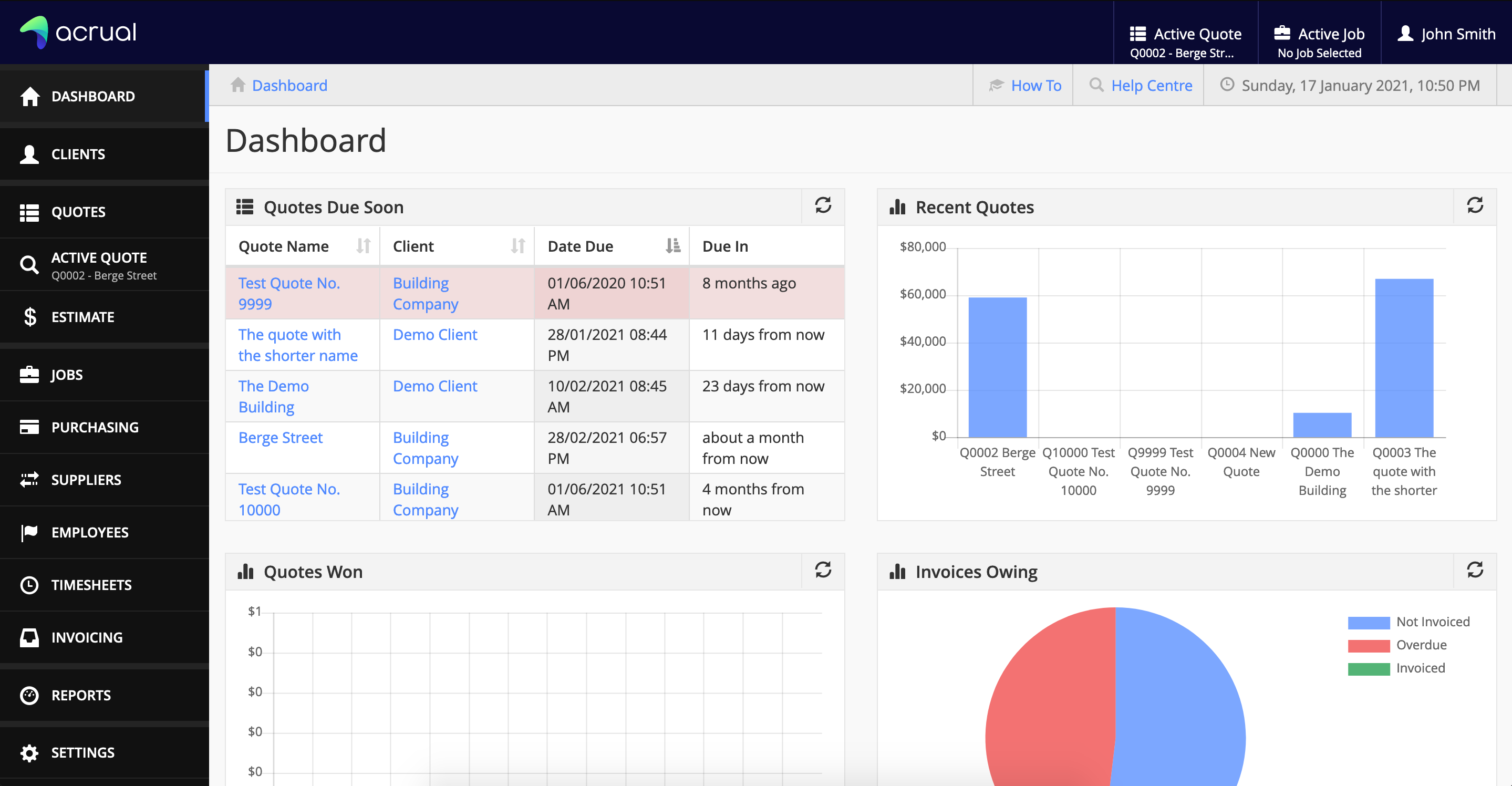
Along with the new logo, we’ve also worked on a brand new colour scheme. This will give Acrual a fresh new look and feel. Under the covers, it is still the same Acrual that you know and use every day, but with a more uplifting colour palette to polish it all off. The new colours should make everything look more modern and a bit less flat.
Here is a sneak preview of the new look of the application. Don’t worry, everything is still in the same place it was before.

The new look of Acrual
And with that, it is time to say goodbye to the old logo. It served Acrual well over the years and it will be sad to see it go. So long old friend!

The old Acrual logo
Stay tuned for more updates, and as always, if you have any questions, please don’t hesitate to get in contact.